
Over the years in packaging manufacturing, we have seen the same scene play out countless times. An indie brand founder brings in an impressive design file for prototyping—ultra-fine gold foil text, a glossy black cap, and a rich metallic gold base. Then the first physical sample arrives from the line: the fine text bleeds into an illegible blur, sink marks wrap around the glossy black cap, and the gold base turns out muddy and dull. The premium feel disappears completely.
Design software lets you render anything, but production lines operate under physical constraints. Samples tell the real story. Premium perception depends as much on the factory floor as on the design file. True luxury has to survive both prototyping and mass production. Based on costly production mistakes we have witnessed over the years, here are 5 cost-effective packaging techniques that deliver an upscale feel.
Consumers do not assess packaging quality by reading price tags. They evaluate it through three distinct checkpoints:
- First glance from afar: Silhouette, whitespace, and typography.
- Picking it up: Weight, closure mechanism, and tactile surface feel.
- Inspecting up close: Finishing techniques and fine details.
Among these three, visual design is the most economical to upgrade. Adjusting whitespace and font weight costs nothing on a layout. Physical touch, however, requires direct investment—counterweights, magnetic closures, and soft-touch coatings all add unit cost. When your budget only allows one or two upgrades, spend money on what the customer feels. The eye scans quickly, but the hand remembers. These five tips are arranged around that principle: the first focuses on tactile feel, and the remaining four focus on visual execution.
1. Maximize the Tactile Feel of the Cap
Many assume luxury is purely visual, but tactile feedback registers first. Packaging research consistently shows that heavier containers drive higher perceived quality. Why do luxury lipstick tubes feel so substantial in hand? Manufacturers insert custom counterweights inside—iron, zinc alloy, or ceramic inserts designed specifically for heft. The cap is the component consumers hold the longest. It serves as their first measure of your product’s build quality.
Invest in the opening and closing action first. That crisp snap of a magnetic closure requires precise calibration. Cosmetic packaging engineers typically tune magnetic pull force between 2 N and 10 N. Anything under 2 N feels loose and cheap; anything over 10 N makes the cap frustrating to open. Finding the sweet spot takes physical testing. Keep in mind that magnetic closures increase total packaging costs by 40% to 50% compared to standard snap-fit caps. If you run a tight budget, save magnetic closures for your top one or two flagship SKUs.
Surface texture comes second. Avoid leaving injection-molded plastic caps bare. Applying a soft-touch coating—an industry-standard tactile lacquer with a velvety, rubber-like feel—elevates the part well above high-gloss plastic. Choose colors carefully. Soft-touch finishes wear down under friction and can develop shiny burnish marks. Pure black shows fingerprints and friction marks far more easily than charcoal gray or deep navy. If you want a soft-touch finish, dark gray or navy is the safer route.
Heft is the third factor. If counterweights exceed your budget, avoid ultra-thin, lightweight cap walls. Selecting a heavier wall thickness creates an immediate tactile difference the moment a customer picks up the unit.
A practical production tip: friction wear and fingerprint smudges do not show up on a display shelf. During sample approval, ask the factory to rub the sample vigorously dozens of times. Check how easily burnish marks appear before signing off on the material batch.
Prioritize your tactile budget in this order: closure action first, surface texture second, and heft third.
2. Increase Whitespace and Narrow the Typography
The least expensive way to make packaging look expensive requires no extra finishing costs—it comes down to visual reduction. Consumer studies reveal a counterintuitive finding: tall, condensed typography, generous negative space, and clean surface layouts instantly increase perceived luxury. Cluttered, text-heavy packaging signals budget retail rather than high-end beauty.
Apply three practical rules: scale your logo down one size, widen the outer margins, and select slender, condensed fonts instead of round, wide typefaces. The same applies to bottle labels—condensed lettering surrounded by ample whitespace looks far more upscale than busy graphics. This controls the initial visual checkpoint on retail shelves and e-commerce hero images. Customers notice visual density before they ever inspect manufacturing details. Camera lenses magnify that density further in customer unboxings and short-form video reviews.
Avoid one common false economy: never print product labels on home desktop equipment. An indie beauty founder once noted that printing labels at home was her biggest early mistake. She realized building a true brand requires shifting from a craft-market mindset to a department-store standard. Labels receive intense customer scrutiny. Money saved on DIY printing translates directly into a cheapened brand image.
3. Use a Single Area of Hot Foil Stamping on Outer Boxes
The rich gold shade in your digital mockup often looks disappointing in real life. Standard four-color process printing (CMYK) cannot replicate metallic luster. On paper, CMYK gold turns out as a flat, muddy yellow-brown. The screen misleads; physical ink does not. Achieving true metallic luster requires either metallic spot inks (pre-mixed formulations containing metallic flakes) or hot foil stamping (pressing metallic foil onto paperboard with heat and pressure).
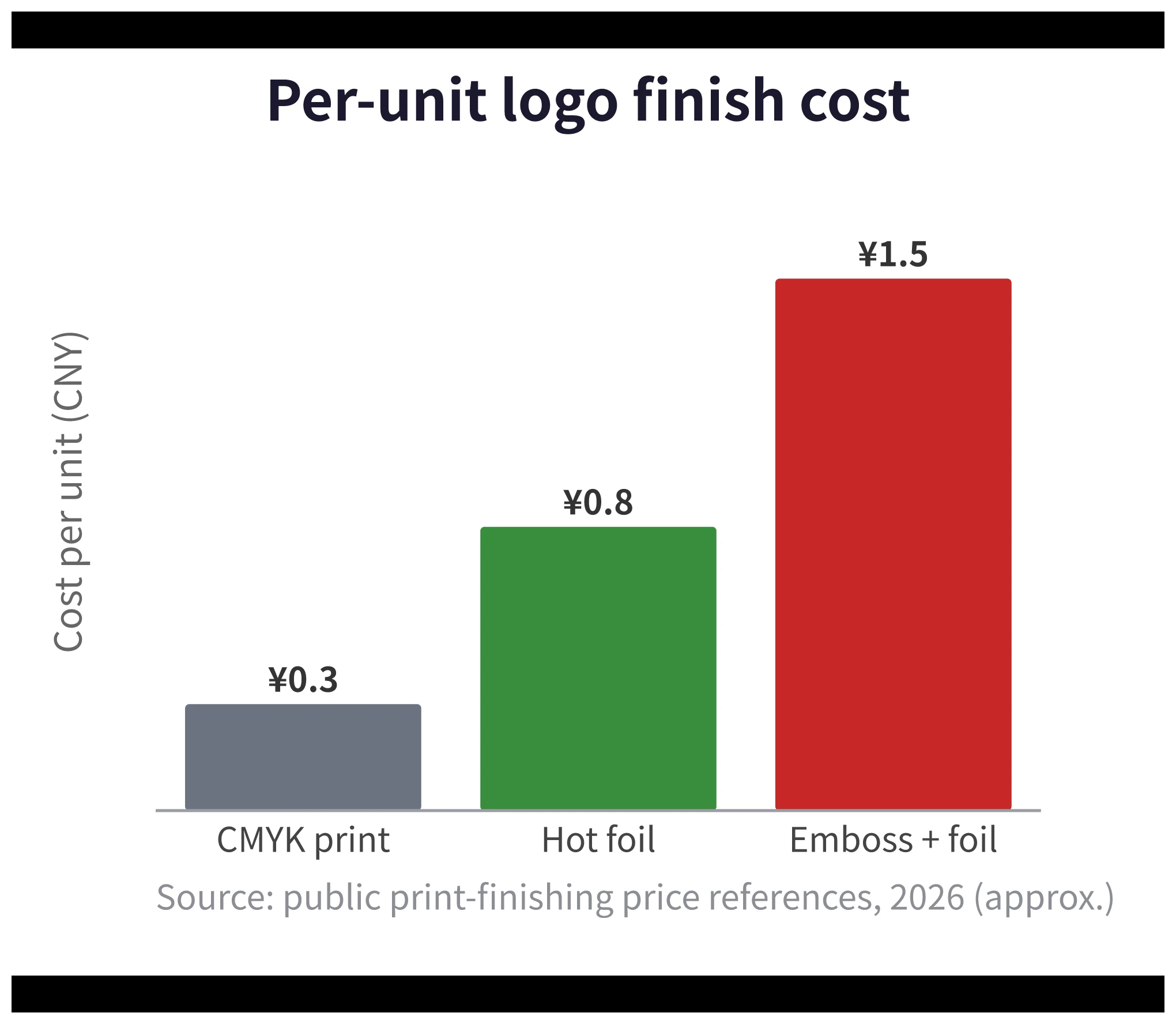
Why should emerging brands prioritize hot foil stamping? Experienced packaging professionals know that for identical bottle molds or box structures, surface finishing accounts for roughly 80% of perceived quality. Foil stamping offers the highest return on investment among all finishing options. Consider standard folding cartons with logo branding as a baseline:
- Standard CMYK printing costs around $0.04 per unit.
- Hot foil stamping costs around $0.12 per unit.
- Combination embossing plus hot foil stamping runs around $0.22 per unit.
The price difference between a basic box and boutique-grade packaging is roughly $0.18 per unit. Spending an extra $0.07 on a foil-stamped logo significantly boosts perceived value.
Watch out for three production pitfalls. Check the first two during prototyping and the third during quoting:
- Stroke width: Foil stamping cannot match offset printing resolution. Ultra-fine lines bridge, fill in, or break apart during stamping. We frequently see rework caused by blurred foil text. Thicken fine lines and small logos before stamping.
- Embossing requirements: Crisp blind embossing requires minimum parameters: at least 1 pt (0.47 l) line width, 11 pt (5.2 l) font size, and paperboard weight of 300 gsm or higher. Embossing below these thresholds creates undefined, muddy shapes that look cheap rather than subtle.
- Tooling fees: Both foil stamping and embossing require custom dies. Copper dies offer long-run durability, while zinc dies cost less for short production runs. Tooling fees get overlooked easily on packaging quotes, so clarify die charges upfront.
Exercise restraint with surface area, not impact. Covering an entire carton in foil resembles a wedding invitation. A high-end lipstick tube may undergo five to seven separate finishing passes. While small brands cannot afford complex multi-pass finishing, they can adopt the same underlying strategy: executing one clean finishing process well beats stacking five mediocre ones. A single foil-stamped logo on matte-laminated paperboard creates a quiet, luxurious presence.
4. If You Choose Dark Colors, Use a Matte Finish
Dark colors look sophisticated, but they also expose manufacturing flaws faster than light tones. Be cautious when pairing dark colors with high-gloss surfaces. Plastic injection molding inherently produces slight surface depressions known as “sink marks.” Factory quality standards typically pass parts if sink marks are barely visible to the naked eye. However, high-gloss dark surfaces act like mirrors—any slight depression distorts reflections instantly. Achieving a flawless glossy black cap requires high-precision tooling and extensive mold tuning. If your budget allows for high-end moldmakers, glossy black works fine; otherwise, avoid gambling on that combination.
Use matte finishes or mold texturing instead. Mold texturing (adding fine micro-textures to core and cavity surfaces) hides sink marks and gives plastic a grounded, refined look. Research confirms that matte packaging conveys natural, premium qualities. Industry standards reinforce this: matte film lamination feels smooth and velvety, whereas high-gloss film creates harsh glare. Luxury packaging consistently favors matte over gloss.
Try this cost-effective packaging combination: a light-toned exterior with a dark-toned interior. A light paperboard box paired with a charcoal or black velvet EVA tray creates an instant unboxing contrast with minimal cost increase.
Another smart way to save tooling costs: choose existing public stock molds from a reliable cosmetic packaging supplier and specify custom mold texturing on the exterior surface. You skip custom mold investments while delivering a distinct tactile experience. The bottle silhouette might match standard packaging, but the subtle texture belongs entirely to your brand.
Production tip: Check for sink marks and matte uniformity on the very first physical sample. Rotate dark parts under directional lighting before signing off—side profiles reveal surface defects immediately.
5. Minimize Print Colors on Primary Containers
The fastest way to cheapen a primary container is a misaligned, three-color screen-printed logo. Every additional screen-printed color requires a separate mesh screen and another registration pass. A registration shift of just 0.5 mm destroys crispness. When running small batches, reduce your color count. A three-color silk screen requires three screens and three registration steps. Pairing a single-color screen print with one spot hot stamp requires only one screen and one foil die. Reducing tooling steps minimizes alignment errors and delivers a cleaner aesthetic. Inspect this on your first sample by checking the logo edges under a 45-degree-angled light.
Follow standard industry printing conventions: use spot colors (custom pre-mixed inks that guarantee color accuracy) for high-focus elements like the primary logo and base background. Use four-color process printing for background gradients and secondary artwork. Spot colors protect brand-critical elements where customer attention lingers, while process printing handles large background areas efficiently.
Metallized caps require separate attention. Vacuum metallization (depositing a thin metallic film onto plastic in a vacuum chamber) produces striking mirrored finishes. However, because the coating measures nanometers thick, batch-to-batch color variations occur frequently. Repeat production runs often drift in shade from the original batch. Always archive approved master golden samples and cross-check reorders against them under standard D65 lighting.
Simplification does not mean creating plain packaging. Shifting print color budgets toward cap weight, soft-touch coatings, or exterior box foil stamping upgrades overall brand perception. Strategic reduction frees up budget for high-impact sensory touchpoints.
Luxury Comes from Smart Trade-Offs, Not Massive Budgets
All five techniques boil down to one core rule: spend every dollar on details consumers register the moment they touch the product. Calibrated cap mechanics, balanced whitespace, restrained hot foil stamping, matte dark finishes, and streamlined container printing do not demand massive budgets—they demand disciplined design choices.
Legacy beauty houses build luxury through deep budgets; emerging brands achieve it through smart trade-offs. Customers will recognize the quality of those choices within the first three seconds of unboxing your product.